Problem Statement
How can we help college students currently in LDDRs connect over distance and increase companionship within their relationship?
Dec 2020
Project Details
Project Type: UX Design & Research
Purpose: Academic Team Project
Timeline: 18 Weeks
Methods: Interviews Task Analysis Competitive Analysis Affinity Mapping Prototyping Visual Identity Development Usability Testing Heuristic Evaluation Expert Evaluation
My Contributions
Interaction Designer: Designed the interactions based on preliminary user research & competitive analysis, and revised user flows based on feedback from sketches, wireframes, and the initial prototype.
Prototyping: Responsible for sketching initial brainstorming ideas, creating wireframes, and designing the interactions & interface of the final prototype while implementing our visual design language.
User Research & Testing: Assisted with user interview sessions, user testing sessions, data review & analysis, and writing up results & implementation plans.
Visual Design: Developed the visual design language for our solution & presentation materials, including logos, colors, fonts, and interface elements.
01 Background
Long Distance Dating Relationships
Long Distance Dating Relationships (LDDRs) are defined as romantic relationships between two individuals who are dating but not married, and who are separated by geographically for an extended period of time. While LDDRs have been around for centuries, the digital age has given rise to their prominence and success. Technology is now commonly used to not only maintain communication in relationships, but also to start relationships or enhance them. These digitally-aided relationships are quite common among students - about 75% of college students report having been in a LDDR at some point during their college experience [1].
02 The Problem
Struggling With Companionship
Couples in LDDRs experience their own unique set of challenges within their relationship due to the nature of the distance between partners. For college students, these most commonly consist of challenges related to the time, money, and logistics required to traverse the distance between each other for in-person visits [2]. Past research has found that individuals in LDDRs are significantly less likely to engage in self-disclosure, perceived significantly lower levels of companionship, and had less positive outlooks on the relationship [3]. This both validates the difficulties college couples in LDDR experience with communication and suggests that this problem area is in need of intervention.
For college-aged students, gaining experience in relationships is a crucial component of emotional development, but relationship strain can be detrimental to students’ mental health and academic performance [2]. Through this problem statement, we hope to address both the quality of the relationship and the wellbeing of the two partners in the relationship.
03 The Solution
Reimagining the Digital Love Letter
We designed Glow, a mobile app that helps couples in LDDRs engage in more meaningful asynchronous digital communication by emulating and building on the experience of sending, receiving, and cherishing physical love letters, increasing companionship and wellbeing within the relationship.
04 The Process
Planning Our Research and Design Process
User Research
Ideation
Prototyping
Evaluation
05 User Research
Demographics: The user group we are targeting our solution at is college students aged 18-24 who are enrolled in 4-year residential colleges. Although there are college students who lie beyond our specified age range, this limitation serves as a useful guide for us to pinpoint the lived experience and cognitive development of our intended user group. An estimated 9 million college students in the United States fit this criteria as of 2019 [1][4].
Relationship Status: We are also limiting our target user group to students in monogamous dating relationships. This is primarily motivated by a limited body of past research into polyamarous long-distance relationships, and technological limitations.
Cognitive Aspect: Our target user group may also face issues related to memory, specifically long-term memory retention. A previous study into the effects of distance on relationships found that 40% of participants in LDDRs struggle with an “out of sight, out of mind” mentality that has impacted the quality of their relationships.
Motivation: Finally, we intend to focus on users who have a high level of commitment to their relationship. Prior literature suggests that individuals who are more committed in their relationship are more likely to invest their energy and resources into the relationship, and more likely to stay committed to the relationship [5].
The cornerstone of all romantic dating relationships, especially LDDRs, is relationship maintenance mediated through communication between partners [6]. Increased efforts to maintain quality communication between partners leads to a better understanding of each other’s needs and contributes to the longevity of the relationship’s stability [6][7]. Since partners in LDDRs cannot rely on in-person communication, they must resort to computer-mediated communication (CMC) in an attempt to negate the physical distance between them [6][8]. The range of CMC tools available is broad, and it includes text messaging, voice or video calling, email, traditional mail, social media sites, and other smartphone-based apps [6]. Utilizing these tools for daily interaction between partners is crucial for reaching the user’s goal of increased quality communication, and has also been shown to reduce uncertainties, loneliness, and jealousy while increasing companionship, trust, commitment, intimacy [6][9]. Communication within LDDRs is usually constrained to CMC methods, and therefore the responsibility of not only the couples to seek out methods to strengthen their relationship, but for designers to innovate in the problem space and improve the existing methods of calling and texting [6][10].
Based on our research into our target user group, we have identified three primary user goals we hope to address with our solution:
1. Improve Communication Quality
2. Foster Non-Physical Intimacy & Companionship
3. Reduce Uncertainties Associated with Long-Distance Dating
We recruited seven interview participants from within our target user population of college-aged students who either were currently in or had recently been involved in long distance dating relationships. With these participants, we conducted semi-structured interviews to understand students’ experiences with LDDRs. In particular, we were interested in the challenges and communication methods of LDDR couples, and how current communication methods impact those relationships.
After analyzing the results of our interviews using affinity diagramming, we identified 5 key themes:
1. Relationships are supported by technology.
2. Individuals experience personal growth during LDDRs.
3. Partners should understand how they best give and receive love.
4. Both partners must put in effort to make a LDDR successful.
5. LDDRs are often difficult to manage.
As obvious as it may seem, the task we found that users in LDDRs perform most often is simply communicating digitally with their partner. However, the specific application and means of communication is what differentiates this task for each couple. It may take place over text messaging apps, disappearing image apps, voice calls, video calls, or even virtual reality if both partners are technologically savvy. This means the primary influence on the task environment for digital communication is user preference & communication style. As an example, presented below is a Hierarchical Task Analysis (HTA) for one form digital communication: making a video call.
A second common task we found that users perform (or wish they performed more regularly) in order to strengthen and maintain their LDDR is doing “relationship check-ins” with their partner. In short, this process involves setting aside a time for a serious conversation with your partner about what is going well, what isn’t going well, and what should change in the relationship. The task environment may look different for each couple at each check-in, since the actions of both partners and the overall health of the relationship are factors that impact which subtasks are performed within the check-in. Presented below is a second HTA for relationship check-ins:
06 Ideation
1. Users can send asynchronous messages. Since couples in LDDR are not physically together, it is often difficult for them to be aware of each other’s availability and therefore communicate synchronously. Our interviewees deemed asynchronous communication as critical to the success of relationships, though current platforms are often flawed in many ways.
2. Users can save memories to view at a later time. Enabling users to save memories such as conversations and photos taken with their partners is important because it provides an opportunity for users to engage in relational savoring (i.e. reminiscing on past joint-experiences). The solution will store and aggregate cues that users rely on to retrieve past memories, thus providing a potential remedy for the challenges LDDR couples may experience, improve their moods, and strengthen the relationship.
3. Couples’ interactions and messages are private. Since our overarching goal is to help couples in LDDRs stay connected, we want to ensure that the solution creates a space that is dedicated to only the members of the couple.
1. The solution is low-cost to the user. It is important for the solution to be of low cost to potential users because our product is catered to college students who typically do not have significant discretionary income. Furthermore, we identified through our competitive analysis that similar products in the market are also typically low-cost or free.
2. The solution should make users feel safe. Given the personal and intimate nature of the content that LDDR couples will exchange on the product, we believe that the product should convey a sense of safety and security to our users at all times. Users should know that their private messages will always stay private.
3. The solution will adhere to the principle of availability. It is unlikely that both partners in a couple will use the same hardware, software, or operating systems. Therefore, by ensuring our solution is a cross-platform product, we could potentially reach and benefit a larger segment of our target user group.
4. The solution will be accessible and meet WCAG 2.1 AA accessibility requirements. Relationships transcend physical and cognitive constraints, and therefore our solution, which is intended to promote a sense of connectedness between users, should not itself become a hindrance in this process.
5. The solution will be performant. We think any messaging product should be comparable to the performance of SMS texting since the product will be in direct competition with this universal form of asynchronous communication. This will help our solution stay competitive in the market.
While reviewing our affinity map and design requirements, our design ideas immediately began to flow. We encouraged each other to push the boundaries of our ideas and not rule anything out. In total, we brainstormed 10 divergent design concepts ranging from smartphone apps to virtual & augmented reality environments. From there, we analyzed our ideas in terms of relevancy, technological hurdles, and cohesion with our goals & requirements to narrow down our concepts to two designs, Milestone Markers and Augmented Reality Postcards.
Our first design idea was for an app to help long distance couples to put a positive spin on their distance by earning tokens to symbolize how long they have maintained their relationship while distanced. At each significant time marker, couples will unlock a new prompt to fill out about the other person, such as a reason they love the other person or a favorite memory. To help the time pass more easily, couples can read through their “journal” - a portion of the app that contains all the answered prompts from their partner as well as a log of important milestones.
Our second design idea was for a solution that allows long distance partners to send and receive virtual “postcards” with messages, photos, and/or videos embedded on them. Users could enter the augmented reality viewer of the app and create a “memory wall” in the physical space around them where they could pin postcards they’ve received, along with other photo and video memories.
This storyboard below follows a couple sending each other notes through the Milestone Markers smartphone application. A user can open a personalized milestone note sent by their significant other when a milestone in their relationship has been met. The user can then send their significant other a note immediately using the prompt suggested by the application. The significant other will receive the note and a push notification. While this exchange is happening, the app displays how long the couple has been apart and when they will next meet in person. This storyboard captures the functionality of immediate versus scheduled milestone notes and the fact that the application supports synchronous and asynchronous communication.
The storyboard depicts an LDDR couple that is looking through a photo roll of photos they have taken together. One of them sees a photo they really enjoy and adds the photo to the Augmented Reality Postcard Wall. The application then shows the postcard appearing on the virtual postcard wall when the user points their device any wall in their home. The partner then receives a notification that a postcard has appeared on the virtual postcard wall. The story shows the asynchronous nature of the application as well as the shared experience of seeing the postcard wall. The postcard wall acts as a shared virtual space.
07 Prototyping
We conducted an internal review of our top two designs within our group in order to choose the one with which we would proceed with prototyping & evaluation. We discussed our own past experiences in LDDRs, as well as revisited our user research, user goals, and design requirements. After evaluating the advantages and disadvantages of each design, we settled on a new idea that is a combination of our two leading divergent design ideas, mostly based on the Milestone Markers concept, but incorporating the idea of a novel, digital take on physical mail.
Introducing, Glow! Glow enables partners to send love notes to each other, either just because or on special occasions. When writing a note, you can choose from a bank of curated prompts, or go without a prompt and write whatever your heart desires! Once you send a note, it goes straight to your partner, where they can open it, read it, and store it as a memory in their Love Jar. Additionally, partners can add milestones to their shared milestones calendar, and can choose to be reminded to send a note on these special days. Our goal with Glow is to help college students currently in LDDRs connect over distance and increase companionship within their relationship.
The onboarding process facilitates user account creation as well as the account linking process for partners. The user simply registers using their email address, and receives a secure code their partner can enter during their registration to pair the two users together. Once the code is entered by the other user, the full experience of the app is unlocked.
The Love Jar is the first thing that users see on the home screen once they have paired up with their partner. Initially the jar is empty, but as users receive love notes from their partner, they are stored in the jar as fireflies. The more notes users save, the brighter their Love Jar will glow.
Users can open up their Love Jar at any time to see past opened notes from their partner. Organized by date received and accompanied by thumbnails of attached media, users can scroll through their love notes and reminisce on the times they’ve shared with their partners.
When users choose to compose a new love note for their partner, they can either choose a prompt from the available bank, or write about whatever they’d like! All notes require a title and body text, and users can additionally choose to add an image or video to their note if they wish. Users can also choose if their note will be delivered immediately, or a later date if they are writing the note in advance of a special occasion.
For safety and recovery, users are shown a preview of their note before sending it. After users hit send, they also have a few seconds to retract their sent note if they forgot something, selected the wrong date, or forgot to attach any media.
Users can also access their digital mailbox from the home screen of the Glow app. A notification dot signifies that a new note has arrived in their mailbox. Users can go to their mailbox and open the note from their partner to read, and can select to store it in the jar once they finish reading it.
Also within Glow, users have a calendar they share with their partner, where both users can see upcoming milestones and create new milestones. Some milestones are created automatically based on information gathered during the onboarding process such as anniversaries and birthdays, but couples have the freedom to add any dates they wish to their shared calendar. These dates can also be one-off or recurring events.
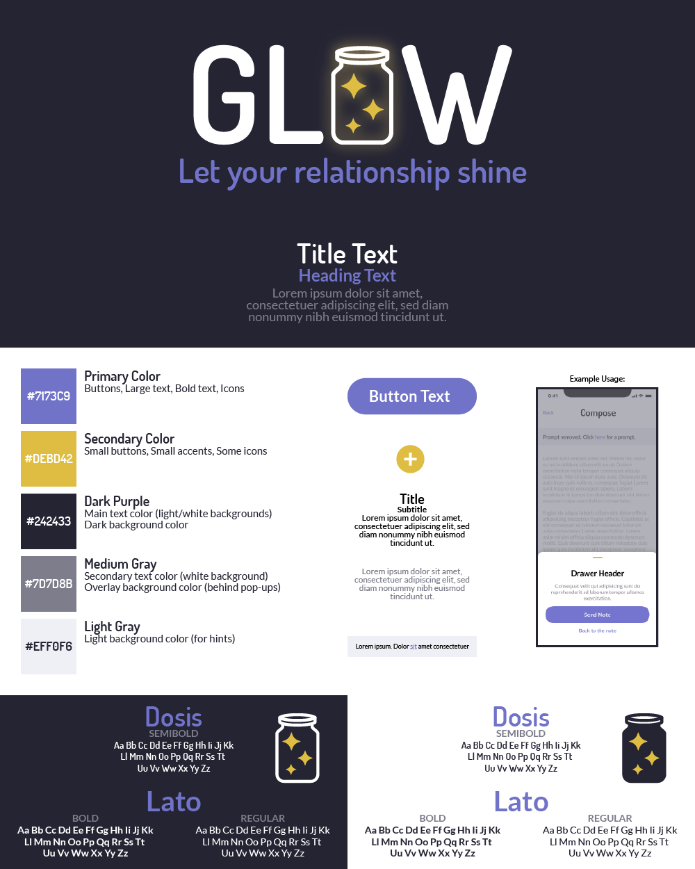
During the design phase of this project, we analyzed the visual styles of six competitor apps in the market in order to create our own visual identity and branding. From our analysis, we determined that our identity should have the following attributes:
After deciding on these attributes, we fleshed out a more comprehensive branding & style guide for our product:
08 Evaluation
We recruited a few of our peers from the Masters of Science in Human Computer Interaction program at Georgia Tech to perform a heuristic evaluation of our prototype during a task-based think-aloud session. We utilized a semi-structured interview technique where we asked questions for each task but also additional unscripted questions to help our team gain better insights. The three tasks we asked users to complete were to set up their account, send a love note, and view a previously read note.
By completing this heuristic evaluation, we were able to identify usability errors and weak points in our design. Some of the most important feedback we received related to the onboarding process: users found it to be lacking tutorials & tips for getting started with the app, leaving them confused what to do when they made it through registration and got to the home screen. Users felt that including these hints, as well as clarifying some interface elements such as buttons and menus, would improve their experience using the app.
After our heuristic evaluation sessions, we asked participants to evaluate the usability of our prototype using a System Usability Scale (SUS) Evaluation.
1 - Strongly disagree, 2 - Somewhat disagree, 3 - Neither agree nor disagree, 4 - Somewhat agree, 5 - Strongly agree.SUS Evaluation Questions | U1 | U2 | U3 | U4 | |
---|---|---|---|---|---|
Q1: | I think that I would like to use the system frequently. | 4 | 4 | 4 | 5 |
Q2: | I found the system unnecessarily complex. | 4 | 2 | 1 | 2 |
Q3: | I thought the system was easy to use. | 3 | 4 | 5 | 4 |
Q4: | I think that I would need the support of a technical person to be able to use this system. | 1 | 1 | 1 | 1 |
Q5: | I found the various functions in this system were well integrated. | 4 | 4 | 4 | 4 |
Q6: | I thought there was too much inconsistency in this system. | 4 | 4 | 1 | 1 |
Q7: | I would imagine that most people would learn to use this system very quickly. | 4 | 5 | 5 | 5 |
Q8: | I found the system very cumbersome to use. | 4 | 4 | 1 | 2 |
Q9: | I felt very confident using the system. | 4 | 5 | 5 | 5 |
Q10: | I needed to learn a lot of things before I could get going with this system. | 4 | 4 | 4 | 5 | System Usability Score: | 62.5 | 67.5 | 95 | 87.5 |
After calculating each user’s SUS, we noticed a sharp divide in the scores. Half of the evaluators scored the system under 68, while the other half scored the system over 87. Clearly, one half found the system to be significantly less usable than the other. Due to this gap in perceived usability, we believe our design requirements were somewhat met, but our solution will require improvements across the system in order to exceed our requirements.
Based on the feedback we received, we decided to experiment with redesigning and restructuring various features of the product to increase usability, learnability, and consistency. Some of our redesigned screens can be seen below, with the evaluated screen on the left, and the fully revised screen on the right. We hope to continue design iterations in a future extension of this project.
Prototype Version 1
Prototype Version 2
Prototype Version 1
Prototype Version 1
Prototype Version 2
Prototype Version 2
Prototype Version 1
Prototype Version 2
09 Takeaways & Future Work
Through designing Glow, I learned how to:
Our prototype evaluation suggests that we still have room to continue iterating on the design of Glow to improve learnability, usability, and consistency. While our group did not have enough time during the semester to conduct a full design iteration, I personally plan to revisit Glow in the future and complete another design & evaluation phase. Below are some areas I will focus on in this next phase:
Tools Used:
Figma Miro Qualtrics Adobe Illustrator
The Team:
Jack Towery, Grace Barkhuff, Matthew Lim, Sara Lin
References:
[1] Laura Stafford. 2005. Maintaining long-distance and cross-residential relationships. Lawrence Erlbaum Associates, Mahwah, N.J. Retrieved September 11, 2020 from http://public.eblib.com/choice/publicfullrecord.aspx?p=255620_0
[2] Aylor. 2003. Maintaining Relationships Through Communication: Relational, Contextual, and Cultural Variations. Routledge.
[3] K. Roger Van Horn, Angela Arnone, Kelly Nesbitt, Laura Desllets, Tanya Sears, Michelle Giffin, and Rebecca Brudi. 1997. Physical distance and interpersonal characteristics in college students’ romantic relationships. Pers. Relatsh. 4, 1 (1997), 25–34. DOI:https://doi.org/10.1111/j.1475-6811.1997.tb00128.x
[4] EducationData. College Enrollment Statistics [2020]: Total + by Demographic. EducationData. Retrieved September 10, 2020 from https://educationdata.org/college-enrollment-statistics/
[5] Caryl Rusbult, Nils Olsen, Jody Davis, and Peggy A. Harmin. 2001. Close Romantic Relationships: Maintenance and Enhancement. Psychology Press.
[6] Carman Neustaedter and Saul Greenberg. 2012. Intimacy in long-distance relationships over video chat. In Proceedings of the SIGCHI Conference on Human Factors in Computing Systems (CHI ’12), Association for Computing Machinery, New York, NY, USA, 753–762. DOI:https://doi.org/10.1145/2207676.2207785
[7] Breeana Skinner. 2005. Perceptions of College Students in Long Distance Relationships. (2005), 5.
[8] Jessica L. Borelli, Hannah F. Rasmussen, Margaret L. Burkhart, and David A. Sbarra. 2015. Relational savoring in long-distance romantic relationships. J. Soc. Pers. Relatsh. 32, 8 (December 2015), 1083–1108. DOI:https://doi.org/10.1177/0265407514558960
[9] Ji-yeon Lee and M. Carole Pistole. 2012. Predictors of satisfaction in geographically close and long-distance relationships. J. Couns. Psychol. 59, 2 (2012), 303–313. DOI:https://doi.org/10.1037/a0027563
[10] Hong Li, Jonna Häkkilä, and Kaisa Väänänen. 2018. Review of unconventional user interfaces for emotional communication between long-distance partners. In Proceedings of the 20th International Conference on Human-Computer Interaction with Mobile Devices and Services (MobileHCI ’18), Association for Computing Machinery, New York, NY, USA, 1–10. DOI:https://doi.org/10.1145/3229434.3229467